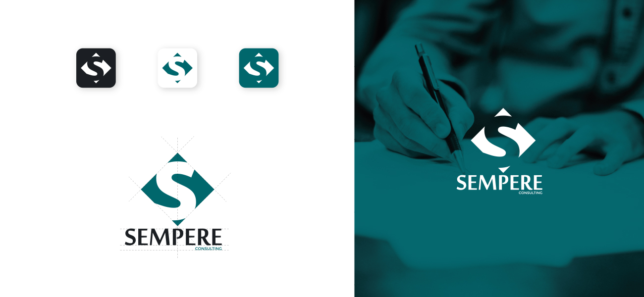
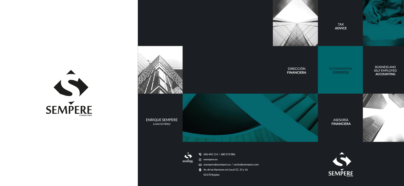
Sempere Consulting sought to position itself as a professional and quality consulting company by creating a global corporate identity that brought together the effectiveness of each and every one of its areas of action.
After investigating and analyzing the brand in depth, we concluded by transforming it with our own identity seal.
We use the first letter “S” as the main factor and stamp that combines not only the name of the brand, but is also printed in a rhombus, whose four sides are the specialties in services that they offer.
To communicate the experience of the staff in the sector we use the corporate colors blue and gray seeking the austerity, elegance and veteran voice of Sempere. Its image is attributed to all its corporate elements as a high-value consulting company, transmitting confidence, perseverance and unity.
Date
February 22, 2016


