What was the challenge that Imi proposed to us?
The brand wanted to present itself to its audience as a professional and expert trauma medical service that combines its experience and extensive knowledge in the field with the most advanced technology.
At 2Brains we realized that these were the two differentiating points of the brand, and therefore its two fundamental pillars when it came to transmitting its values.
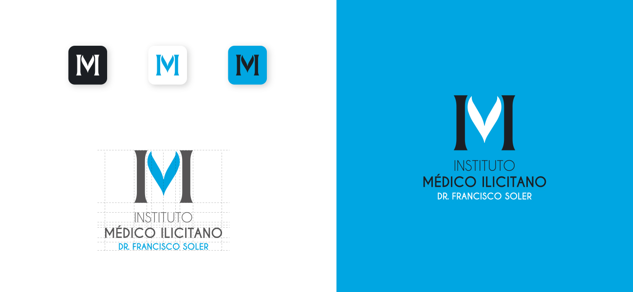
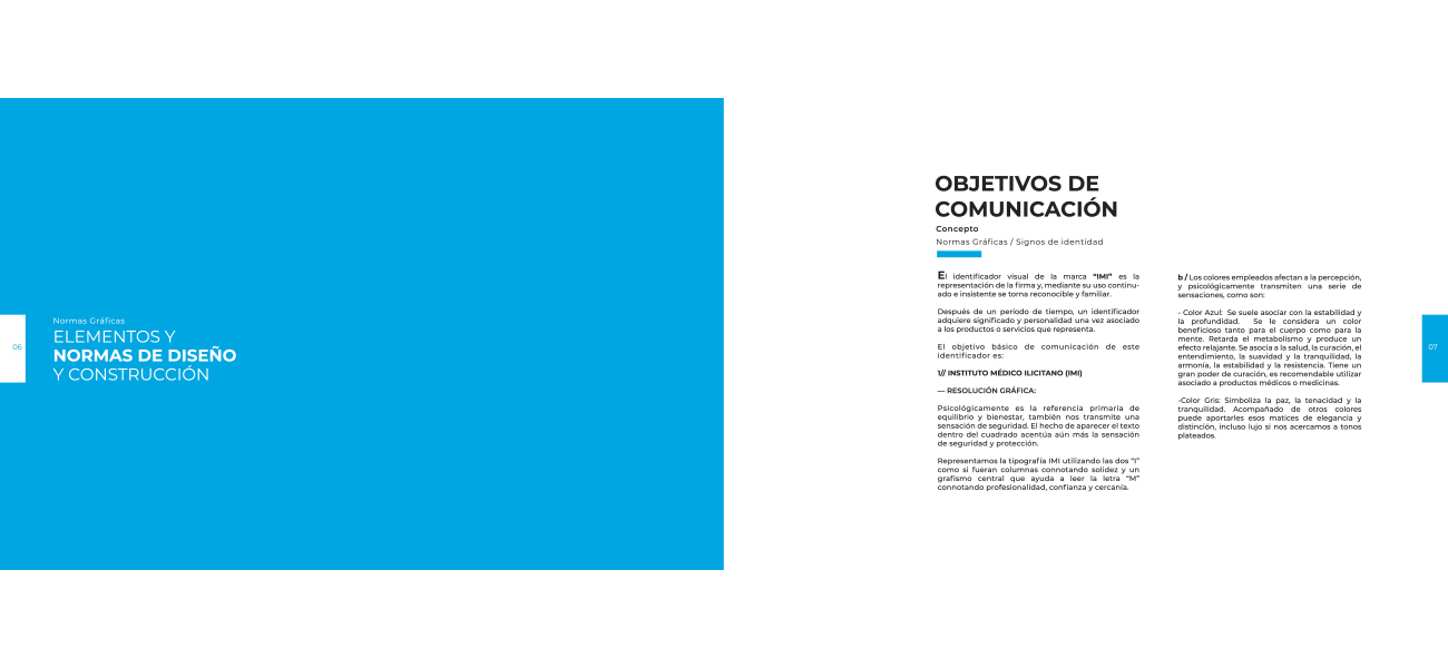
For this reason we created a logo in which we designed an “M” built by two pillars on its sides. These symbolize strength and confidence, and the two fundamental ideas that ImI Soler wanted to express to his audience.
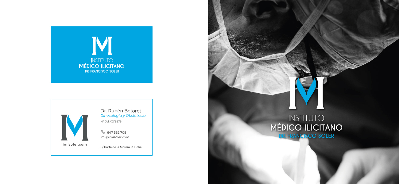
The use of an elegant design that groups two columns gives it authority and security, as well as a corporate image of professionalism and knowledge in its field. We use the colors blue, gray and white to give these connotations to the brand and capture that notable and distinguished aura.
Date
February 22, 2016


