Ghol commissioned us to create its corporate identity as a brand in low-cost gas stations.
What did we do?
We decided to recreate the retro American gas stations of the 50s, where a vintage look reflected the philosophy and essence of the brand. Being a low-cost brand, we also believed it was convenient to communicate the message of quality and durability of the fuels even at a low price.
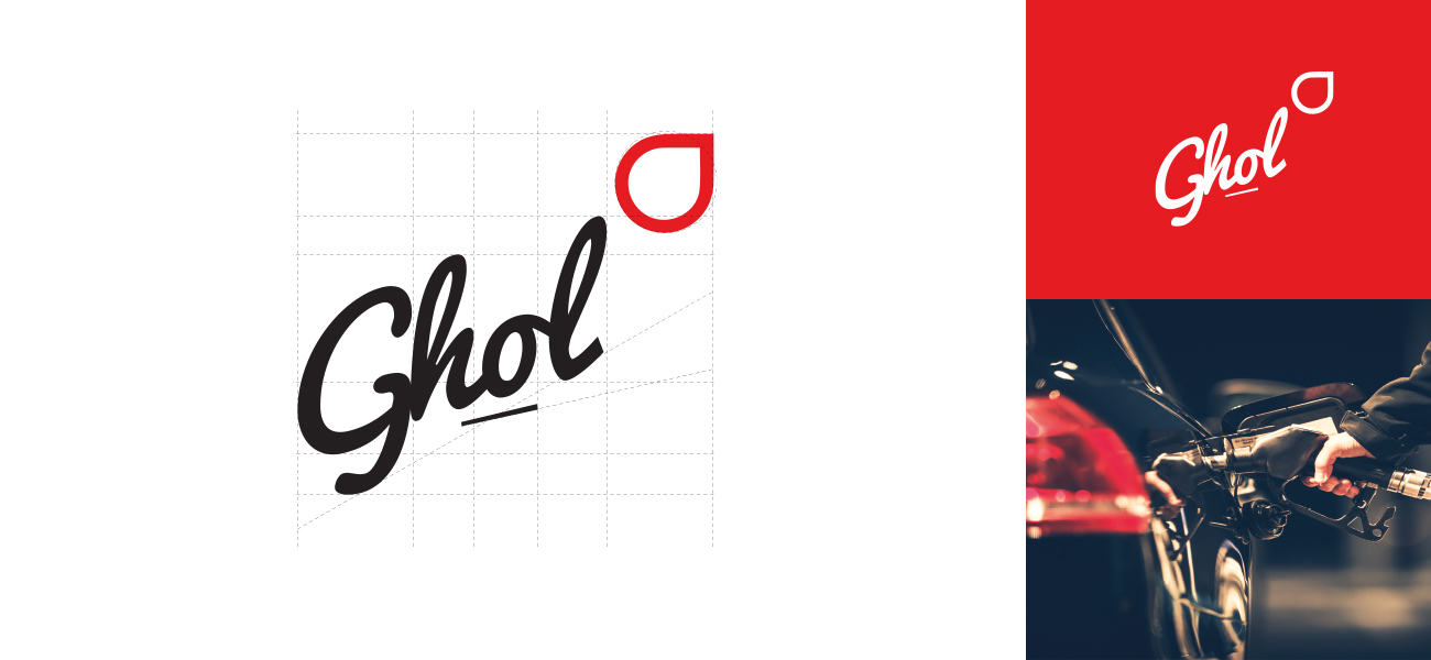
The logo design is formed by recreating a drop coming out of a fountain. This is created through a retro and elongated typeface that, thanks to a change in angle, manages to give shape to such an object.
In this way we build a visual identity of the brand where the vintage concept reflects the concept of low price and exceptional quality of its product.
With the color red we give the brand a striking and attractive power for the public, together with a gray tone inspired by the iron and the material with which the retro gas stations of the 50’s were built on the old roads of the United States.
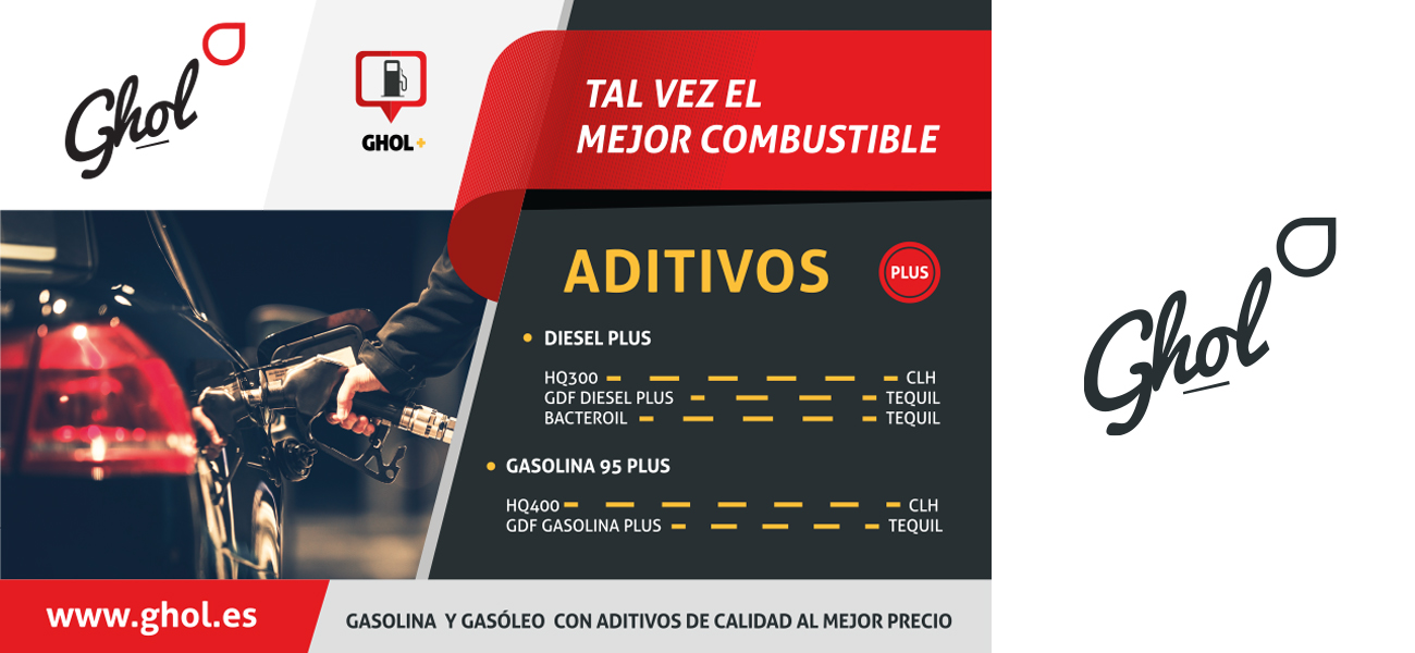
We design Ghol’s brand environment as the trusted destination of its customers, as well as the closest to their journey.
Date
February 22, 2016


