360 degrees has been a clear example of logo restyling and corporate identity in general.
When our client came to us, we proposed giving the brand a twist and designing a unique identity that would convey its identifying trait, elasticity.
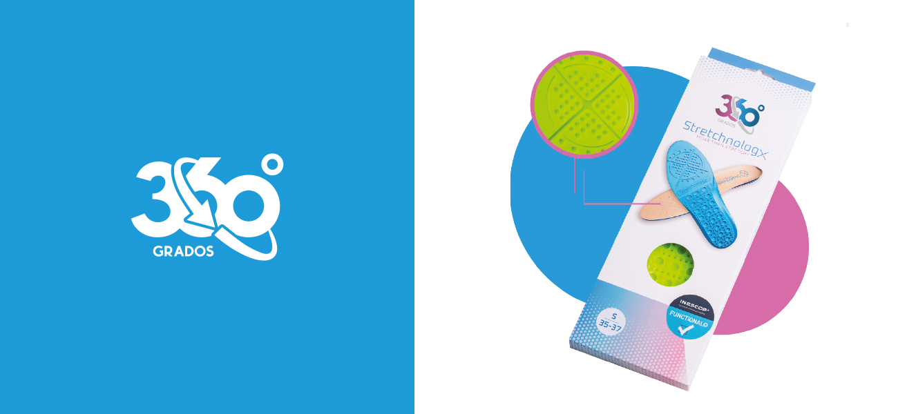
When we studied the client and their products, we saw that one of the main characteristics of the product was its X-shaped composition, and we saw a clear creative concept.
The four directions of the “X” simulated the four directions of expansion, as well as the degrees of inclination in its four axes, 360º. We designed a round logo that reflected the comfort of the product and its elastic quality.
We maintained the brand’s corporate colors and managed to communicate its essence.
We developed its corporate environment by designing infographics, website and elements that captured to the letter the professionalism of the brand and the high quality of its products.
Date
February 22, 2016


